Introduction
Advertisements and posters can deliver powerful messages to different individuals. Many advertisers and campaigners can achieve their goals using the best visual elements. For instance, the anti-smoking poster presented below encourages more people to quit smoking. This anti-smoking poster explores how designers can use of words, images, colors, settings, and layout to deliver the best message to the targeted audience. This discussion presents a visual analysis of an anti-smoking poster.
Visual Argument: Anti-Smoking Poster
The word “type” refers to the nature of words and images in an advertisement. This poster uses appropriate images and words in order to deliver the intended message. The designer has used four words for the poster. Such words explain why smoking is dangerous. The images presented on the poster also portray the dangers of smoking. The designer has “used a 50:50 approach for the images and words” (Lunsford, Ruskiewicz, and Waters 19).
The “words are presented in Sans Serif in order to make the poster more effective” (Lunsford et al. 23). The word “warning” is bolded in order to support the intended message. The poster does not have italicized or underlined words. This functional approach is limited to 2 styles. The pattern of the poster is consistent with these 2 styles. This “pattern shows a close relationship with the text” (Lunsford et al. 27).
The designer has also used “Space and Layout” effectively in order to produce a powerful poster. The layout minimizes the level of confusion and clutter. The designer has used limited images and words. The images and words “create a unique meaning” (Lunsford et al. 52). This layout makes the poster meaningful to the viewer. The concept of “Space and Layout” delivers the best message to the targeted viewer. The designer has also arranged the contents in a professional way.
These parts give the poster a meaningful appearance. The “use of color is critical whenever producing a powerful image” (Lunsford et al. 59). The designer has used several colors in order to produce an appealing poster. These colors include white, black, and brown. These “functional colors present the best relationship between different images and words” (Lunsford et al. 76).
The poster portrays such colors in a realistic manner. The designer has also used real colors for this poster. The colors are also aesthetic in nature. The designer has used disturbing images on the poster. The approach encourages more people to quit smoking.
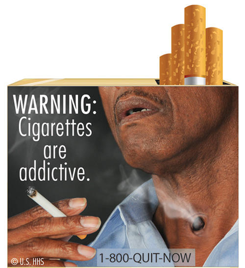
The images also evoke numerous emotional responses. The images present clear relationships with the presented texts. The camera appears to be inside the scene. The poster presents a close-up shot in order deliver the best message. The camera is “inside the scene” (Lunsford et al. 59). This approach gives the poster a subjective effect.
The poster presents clear images thus making it more realistic. The setting presents the dangers associated with smoking. The “relationship between the images and the setting presents a powerful story to the audience” (Lunsford et al. 87). The character on the poster appears weak and disoriented. The facial expression of the character portrays the dangers of smoking.
Conclusion
The above anti-smoking poster portrays the effective use of words, images, color, setting, and layout in a poster. This approach presents the best message to the targeted audience. These aspects make it easier for many advertisers and campaigners to achieve their objectives. Every poster should therefore combine the above elements in order to deliver the best message.
Works Cited
Lunsford, A., John R. and Keith W. Everything’s an Argument with Readings. New York: Bedford St. Martin’s, 2013. Print.